In my previous post, I introduced you to our Step It Up wellness portal at a high level. In this post I will get a little deeper into the infrastructure and SharePoint architecture.
Our infrastructure consists of a combination of physical and virtualized servers. SQL Server 2008 is installed on a dedicated physical server. SharePoint is installed on a virtualized server using Microsoft’s Hyper-V. We use Microsoft’s Internet Security and Acceleration Server 2006 (ISA) on the perimeter (now called ForeFront Threat Management Gateway 2010) to manage authentication (Kerberos), serve the digital certificate, and proxy requests to our SharePoint farm. This is a great model if you need to build-out multiple servers efficiently in a semi-dedicated environment.
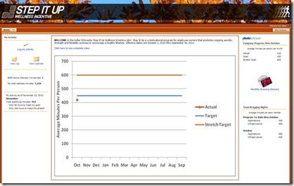
On the home page, I am going to explain the features in eight different zones on the page:
1. Left upper: The “My Activity” web part is a Content Editor Web Part that includes icons and links to ease navigation, resulting is a better user experience. The links simply link to the new page, list view, and calendar view pages for the user’s Activity Log list.
2. Left middle: This is a custom web part (written in Visual Studio) that uses SharePoint’s Object Model to calculate how many drawing chances I have earned to date and how many wellness minutes I have accumulated to date.
3. Left bottom: My activity as of the current date is displayed. We have a summary list that stores the amount of activity for a user by month. When an entry is added or removed from the activity log, an event handler (written in Visual Studio) increments or decrements the monthly total for the currently logged-in user. The presentation on this page is another custom web part that uses the Object Model to query the user’s totals.
4. Center top: The welcome message is in a Content Editor Web Part that is edited by the program administrator. The content contains a hyperlink for displaying the complete rules. When clicked, the hyperlink executes jQuery script to show or hide the complete program rules. If you are interested in learning more about jQuery in SharePoint, check out our earlier blog posts.
5. Center bottom: The chart that appears in this section is a visual representation of the company’s progress – averaged by user. This is a nice feature on any SharePoint site to give it that dashboard look-and-feel. While this chart could have been built dynamically using jQuery, it only takes a few seconds to build it in Excel and save it to a SharePoint image library. Since it is only updated once a month (after the preview month’s data has been tallied), we decided to take this approach to save time. We believe in using the right tools for the job out-of-the-box, and customizing when it is necessary or produces a Return on Investment.
6. Right upper: The “Company Progress thru [Month]” section numerically displays the company-wide average activity to date. This is the same information that is plotted on the center chart by month.
7. Right middle: The “Monthly Drawing Winners” image link links to the list view for a custom list that simply displays the winners for each month in columnar format.
8. Right bottom: The “Team Bragging Rights” section displays the totals for our two teams (Applications and Infrastructure) to date and for the last month. A lookup column is included in our Participants list to link a participant to a team. A custom web part uses the Object Model to summarize the results by team.
That gets us a little closer than the 20,000 foot view. Whether this blog series lives on or not is up to you. If you are interested in learning more about how these sections were developed, leave a comment and tell which of the sections (1-8) is of interest to you. I will talk about the nuts and bolts of how these sections were developed only if you ask.


No comments:
Post a Comment